UCSD Center for Epigenomics
EXPERIENCE DESIGN, VISUAL DESIGN, DESIGN SYSTEMS, UI DESIGN, INFORMATION ARCHITECTURE
A bioinformatics research center at the University of California, San Diego reached out to me for help with an internal website design.
I worked with a member of CFE, who was responsible for the website development, to provide a portal for researchers to access their published data in a clear, easily navigable way.
Context
The Center for Epigenomics at UCSD is “a state-of-the-art collaborative research center specializing in the development and use of cutting-edge technologies to study the epigenome in the context of human disease.”
CFE is a fee-for-service facility that specializes in performing genetic and epigenetic assays and associated bioinformatic analysis with research institutions.
They asked me to design a website to showcase data from scientific papers, usable both by collaborators and (potential) investors.
Tools used: Figma, Illustrator, Photoshop, Maze
Design Process
Part 1
Research & Ideation
Current site analysis
Low fidelity wireframes
User testing
Client feedback
Updated wireframes
Part 2
Design
Style iteration
High fidelity wireframes
Client feedback
Component updates
Part 3
Review & Handoff
Final review
Developer handoff
Research & Analysis
I started with a meeting with my primary contact, the CFE member who was developing the site. He’d started building it already, and needed a designer to come in and help.
My first order of business was a heuristic analysis of the existing site and content so far.
I took notes on the elements of the site that needed the most attention in order to present the wealth of information as clearly as possible.
Low Fidelity Wireframes & Testing
After the heuristic analysis and discussion with the developer, I created a set of low-fidelity wireframes. The sitemap was already established, so my main task was to translate that to a visual format.
I had an additional design constraint, which was that the developer I worked with was in the early stages of his software engineering journey. So I had to make sure that my designs were as easy and straightforward as possible to translate into code.
My next step was to test the low-fi prototype on a range of users. I asked people familiar with the scientific data and people who had no experience in the field to click through the prototype using Maze, a user testing application compatible with Figma prototypes.
Style Iteration
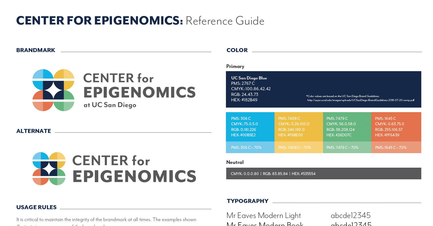
One of the requirements of the site design was that we use the Center for Epigenomics’s visual standards, in conjunction with UCSD’s visual standards (there is a significant amount of overlap between the two).
Using those design standards, I created a set of components—buttons, cards, headers, footer, etc.—in Figma that would allow me to build out a high-fidelity prototype of the website.
Client Feedback & Component Updates
As I worked on the high-fidelity wireframes, the developer and I met weekly to discuss edits and modifications needed along the way. We discussed and tested a number of options for layout, color, and wayfinding indicators before landing on our final prototype.
Final Design
After my final designs were approved, I passed everything off to the developer. We had a final meeting to go over my design and to ensure a smooth transition between design and development.


