Frame
VISUAL DESIGN, DESIGN SYSTEMS, UX DESIGN, INFORMATION ARCHITECTURE, MOBILE APP DESIGN
As part of my onboarding process at Cantina Consulting, I was given free rein to use my knowledge of the design process and work on any problem of my choosing.
Frame is a resource for art lovers who want to display meaningful art in their homes and to support independent artists. It makes local and affordable art accessible and easy to find.
Tools used: Figma, Photoshop, Illustrator, Figjam, Maze
Design Process
Research & Ideation
Problem identification
Complexity mapping
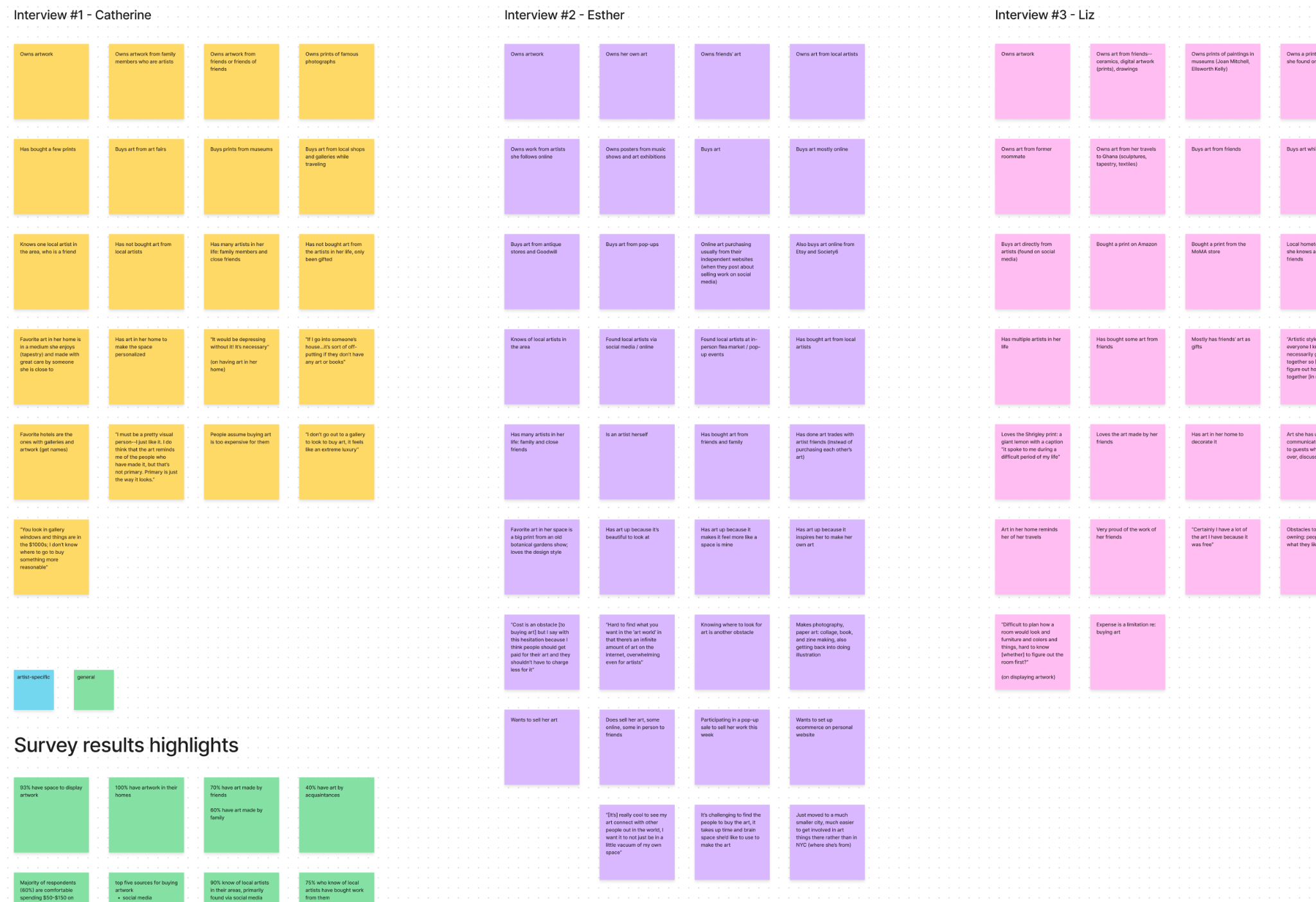
User interviews
Surveys
Affinity & empathy mapping
User persona
Competitor analysis
Part 1
Design
Feature prioritization
Sitemap & user flows
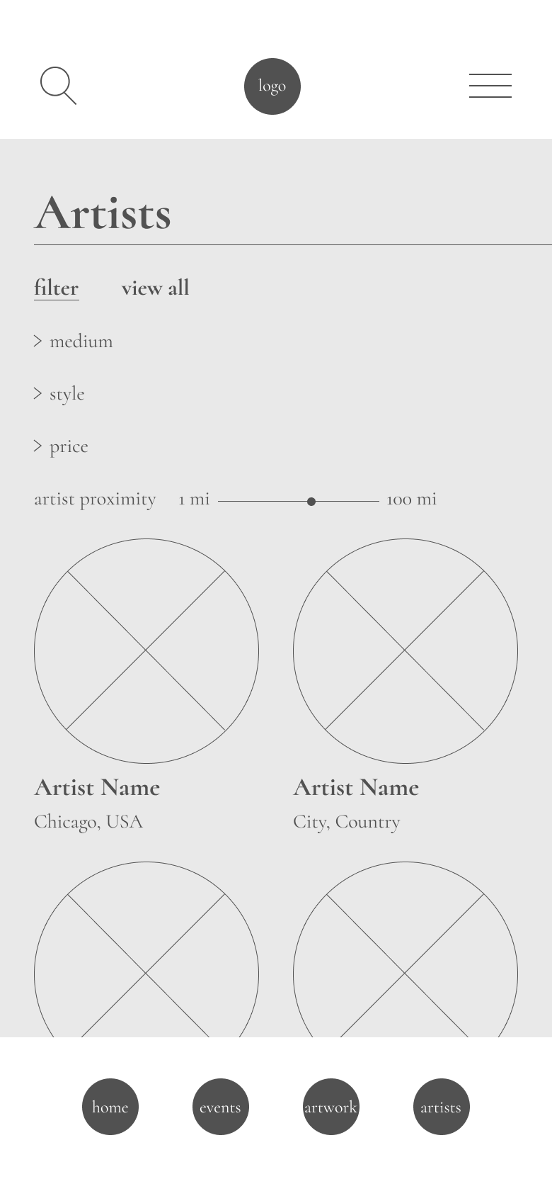
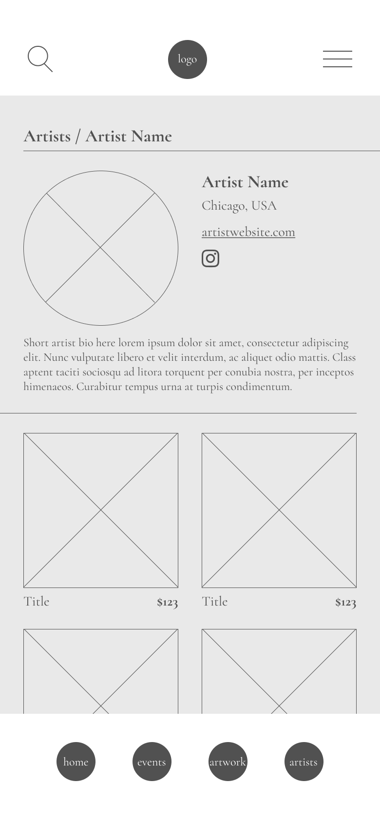
Wireframes
Low-fidelity prototype
Implementing testing feedback
Visual design
High-fidelity prototype
Part 2
Testing & Feedback
Low-fidelity user testing
Iterations
Peer review & feedback
Part 3
Research & Ideation
Where to start?
An open-ended project like this meant a very wide range of options to choose from.
A lot of the topics I’m interested in are very broad and not particularly well-suited to a shorter term project like this one.
Identifying a problem
Complexity mapping allowed me to filter through my ideas and identify areas of highest impact/lowest complexity.
I ended up choosing one that provides a lot of interesting opportunities, and would be relatively straightforward to research using the resources available to me
While the topic is of immense interest to me, something mental-health focused would present some major blockers, the most obvious being my lack of expertise in the privacy laws around medical data.
I chose to focus on a problem I identified in the art world.
The Problem
I decided to focus on something that would be relevant to a lot of people, whether they’re creative or not.
The guiding research question here focuses on art buyers rather than sellers.
My personal network is full of people who either have art in their homes and have strong aesthetic opinions about the space they live in, and/or are artists themselves, so this one was pretty straightforward to research in a short period of time.
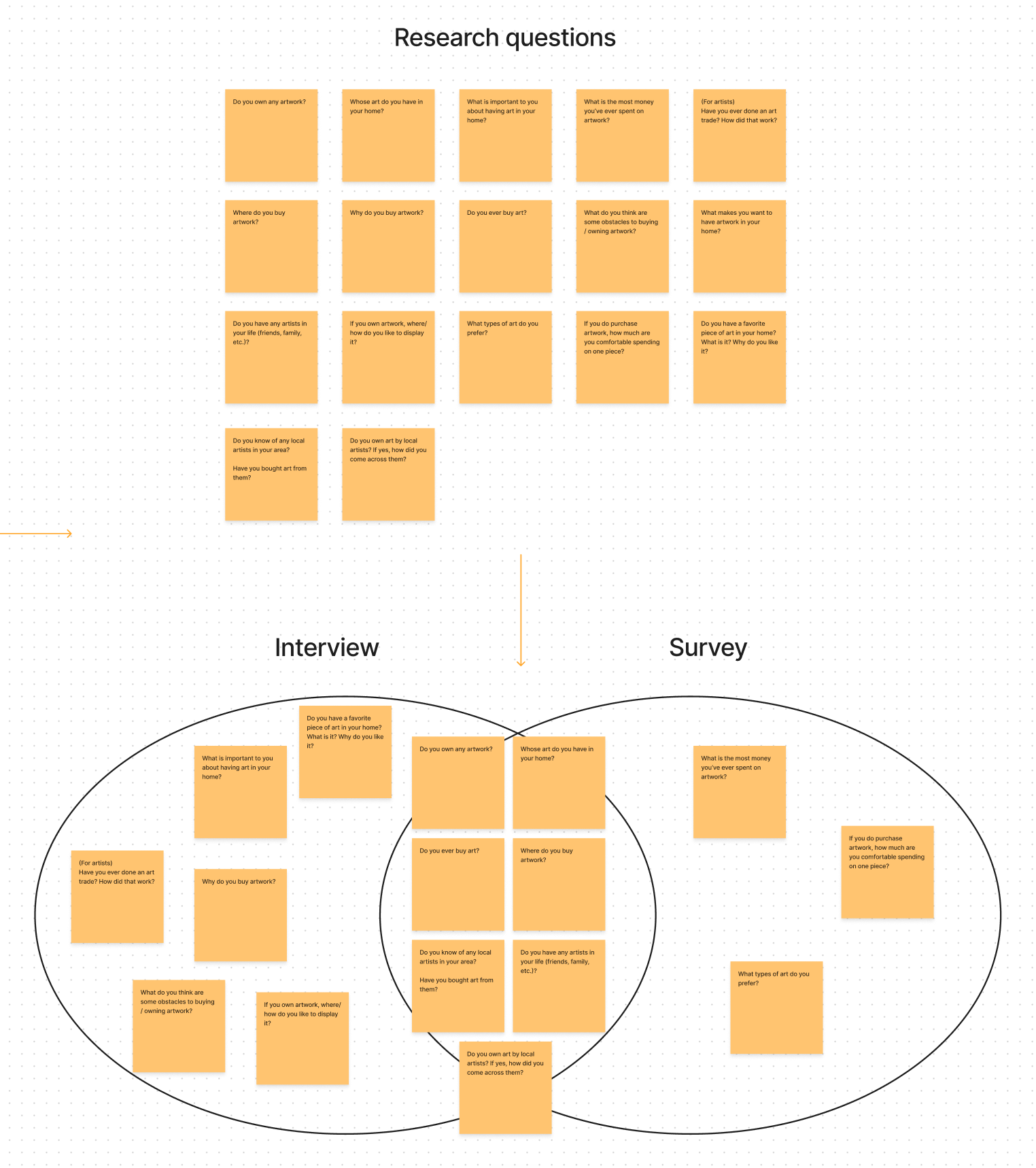
Research questions
The survey questions I put together were more quantitative, and the interviews were more qualitative and discussion-oriented.
Target audience:
Anyone who currently has artwork in their home
Anyone who wants to support local artists when possible
(secondary) Artists who want to sell their work
My assumptions:
People being interviewed/surveyed enjoy looking at artwork
People being interviewed/surveyed want to or already have art in their homes
Survey & interviews
Both the survey and the interviews included a few extra questions for artists.
I had 3 interviewees at various stages of life and income levels. One is an artist and two are non-artists.
39 people responded to the survey.
26/39 respondents are artists themselves
93% of those polled have artists in their lives (friends, family, etc.)
90% know of local artists in their areas, primarily found via social media
Majority of respondents (60%) are comfortable spending $50-$150 on artwork
Top platform for the artists polled who sell work online is via Instagram
Affinity & empathy mapping
I sorted through my interview notes and survey results to paint a picture of what a typical user might look like.
Key topics:
Artists in people’s lives
Where people buy art
The art they already own and its emotional significance
Cost of buying art
How might we…
Who are we designing for?
Anyone who currently has artwork in their home
Anyone who wants to support local artists when possible
Someone who enjoys having a personal connection with the artwork in their home
Common pain points:
Cost of artwork
Knowing what they like and what aligns with their personal tastes
Knowing where to find the types of art they like
Feature prioritization
There were many feature options, but I decided to narrow it down to three.
The key was to address users’ need to filter by price and, of course, location so that they can discover local work. Additionally, interaction with local artists could increase the likelihood of personal connection to the artist and their work.
Competitor analysis
There’s a lot of information to to unpack here. Instagram is super popular, but isn’t necessarily a great tool for discovering new artists since it’s dependent on an unknown algorithm and on how each artist engages with the social media platform. Etsy is really difficult to filter through because there’s almost too much available.
Sitemap and user flows
There are three main sections of the app:
Artists
Artwork
Events
I created user flows for onboarding, exploring events, and discovering artists.
Design
Wireframes
Paper wireframes came first to map out each section of the app.
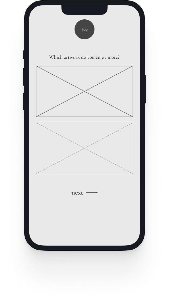
The low-fi wireframes are quite pared down: grayscale, with placeholder text and images.
Low-fidelity prototype testing
For this, I used Maze, which allows for remote prototype testing at the user’s convenience.
The downside, of course, is not being able to observe testers in real time.
I set up three main tasks for the testers to complete. They also were able to give open-ended feedback after finishing the tasks.
Onboarding
Visit artist profile
Add artwork to cart
As with any low-fi prototype, some of the feedback was about needing more color, imagery, etc.
I also found through these tests that the app needed more clarity around the filtering tools for art/artists/events.
Takeaways from first round of testing
Most people got through each task.
However, trying to test a platform centered around visual art in this first iteration (with image placeholders) left users feeling a bit lost.
Quiz at the beginning could be reworked to reflect the filtering criteria for artwork, and the filtering tools themselves needed more clarity/detail.
Feedback implementation
The next prototype needed to have a few updates:
Edit quiz to reflect filter options
List fees for events on detail page and in list
Show number of filtered results
Imagery, color palette, higher-fidelity styling (visual identity)
Surface something new on the home screen to keep it fresh for frequent users
Adhere to number conventions and button styling to help the user understand the interface easily
More research on mobile e-commerce best practices
Visual identity
I chose a mostly grayscale look to let the images of artwork for sale stand out and take center stage, and added one brighter accent color to add some dimension and a contemporary feel.
I also implemented some textures that evoke pencil shading and drawing, to call to mind the artist’s process of making.
High-fidelity prototype
The “Featured Artist” block on the home screen will cycle through different artists and events to keep this page engaging and fresh.
The quiz was slightly edited to ask the user to consider style preferences rather than simply comparing two images, and I used open-source images from the National Gallery as stand-ins for what will be real-life artists’ work, which was a fun art history exercise!
The logo (and the app name) were inspired by the edge of a picture frame or a window.


